Moondance - Bead Star 2010 "Stones" Entry
Beads and findings inspire me. It is really hard for me to order beads on-line. I like to hold the gems and components in my hands, feel the texture and look at the color. Bead shops have a limited inventory, this why I like to shop at Gem Faire. The Gem Faire show takes place every three months at the Orange County Fair Grounds. California does not host the Bead & Button or Bead Fest shows. Really, Gem Faire is the only game in town. I am awaiting the day that Bead Fest or the Bead & Button show finally arrive in California.
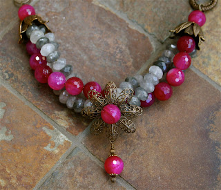


I have always like the color combo of gray and pink. When I found these strands of pink dyed agate and gray quartz at the Gem Faire bead show I was smitten. The vibrancy of the dyed pink agate is breath taking.

The original idea floating in my head was pink, gray and sterling silver. When I started to design that night, I was drawn toward Vintaj Natural Brass (big surprise there) and the necklace took on a life of it's own.

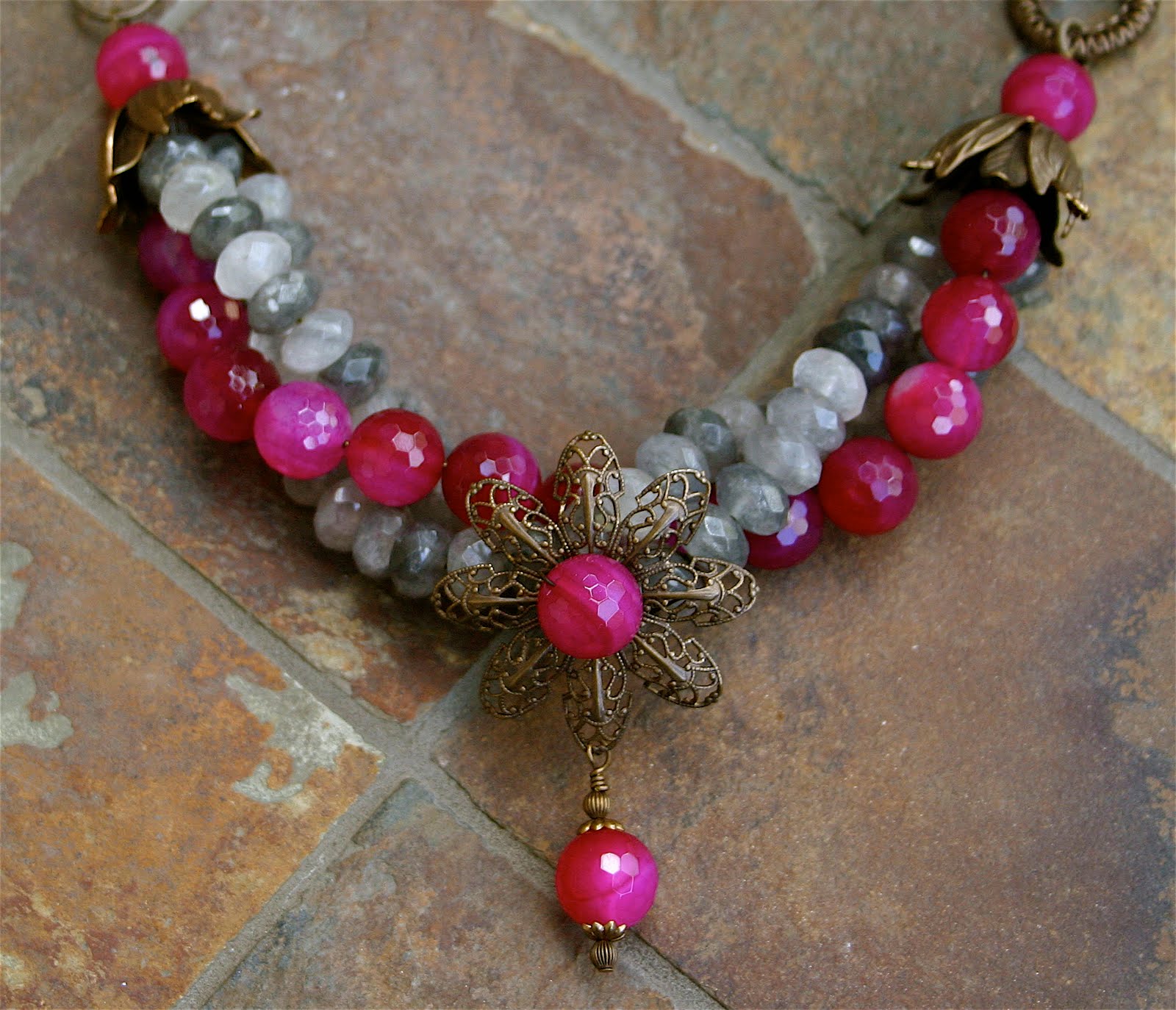
After completion of the design, the image of a butterfly dancing around a flower in the moonlight stuck in my mind. I know, I have never seen a butterfly dancing at night either. I tried other names but I keep coming back to "Moondance". The photo above shows a clearer image of the butterfly clasp.

The rondelle faceted gray quartz features many lovely tones. The tones range from white to charcoal.

The photo above was taken by a professional photographer. Once again, I was not happy with this shot. The professional picture is not focused clearly and looks washed out. My blog photos were taken after the entry was submitted. There is a huge difference in clarity and color.

I was concerned with the pink, gray and brass color combination. What do you think of the colors? Do you like the brass or do you think it would have looked better in sterling silver? Personally, I like the brass. It is very unique color combo and design.


Your picture is much better! It seems to leap off the page vs the other photo. I do love how you make your clasps--very clever! The brass is a really nice contrast against the cool tones...so it makes it more striking. I think using silver would have made it much more formal.
ReplyDeleteBead Happy!
Michelle
Hi Michelle
ReplyDeleteYou are right, the silver would have made it much more formal. This photography thing is driving me crazy. I guess I cannot take pictures under pressure.
You made the right choice going with brass. Silver would be sort of an obvious choice, but I think would wash out against the gray tones.The brass is a much better contrast and warms up the piece. I'm betting this one will do very well in the competition. Such striking colors! And the clasp is excellent!
ReplyDeleteErin
I really like what you did with the butterfly. That is my favorite part.
ReplyDeleteEnjoy the day!
Erin
You do beautiful work Denise. Thanks for flying over to my nest...maybe we'll see each other at GF.
ReplyDeleterobin
I especially love everything you did with the brass...good luck in the competition.
ReplyDeleteI just love anything with red in it!
ReplyDelete