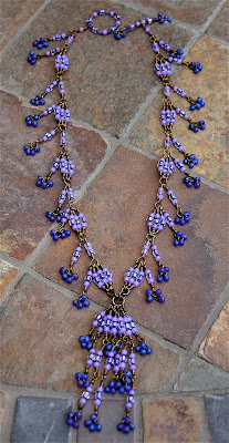
Milday Sayde - Bead Star Under $25 Entry
I thought it might be interesting to take close up pictures and share my design process for each "Bead Star" entry. It was quite an experience trying to come up with unique designs for each specific category. I decided to feature three a week until the voting is completed. My first feature is in the Under $25 category. The name of the piece is "Milady Sayde". This design was named after my God Mother and Aunt Sadye Chacon. I like to name my pieces after someone special. Sometimes this is not possible because the design just doesn't fit the style of a specific person.
I had a horrible time taking photographs of this piece (notice how much better this picture is - just my luck). The photo in the Bead Star competition does not do it justice. My sister-in-law was voting the other day and wanted to guess what designs were mine. She picked every design except this one. She said it looks "Indian". That is not the case, the picture is just bad. "Milady Sadye" is very delicate. I originally designed it for the Seed Beads category. When I realized that I made it for a grand total of $13.40 I had to enter it in the Under $25.
I came up with this design technique a couple of year ago. I used a similar technique on "Fleur de Niece". Fleur de Niece was originally designed for Stringing Magazine. It ended up as a Beading Daily free downloadable project.
This technique is extremely time consuming. Sometimes I would break the fragile seed beads during the wire wrapping process and have to start over again.
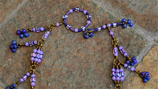
Clasps can be expensive. I like to make my own clasps to keep costs down. The photo above is an example of making your own clasp with wire and beads. Very few jump rings were used on this design. Most of the beads are link by wire before wrapping.
Above is the Bead Star photograph. Does the design look different to you now that you have had a chance to look at the other pictures? I'd love to read your comments.
I had a horrible time taking photographs of this piece (notice how much better this picture is - just my luck). The photo in the Bead Star competition does not do it justice. My sister-in-law was voting the other day and wanted to guess what designs were mine. She picked every design except this one. She said it looks "Indian". That is not the case, the picture is just bad. "Milady Sadye" is very delicate. I originally designed it for the Seed Beads category. When I realized that I made it for a grand total of $13.40 I had to enter it in the Under $25.
I came up with this design technique a couple of year ago. I used a similar technique on "Fleur de Niece". Fleur de Niece was originally designed for Stringing Magazine. It ended up as a Beading Daily free downloadable project.
This technique is extremely time consuming. Sometimes I would break the fragile seed beads during the wire wrapping process and have to start over again.
Clasps can be expensive. I like to make my own clasps to keep costs down. The photo above is an example of making your own clasp with wire and beads. Very few jump rings were used on this design. Most of the beads are link by wire before wrapping.


I agree that your second picture is a better representation of this. I like to take all these different shots and then make a collage using Picasa. You should try it.I think that the lighting is better on these new ones and the background gives it texture without being too busy (the other background gives it a different color cast and washes it out I think). Focusing on improving my photography is something I continually strive for and have been working on for years.
ReplyDeleteI like hearing the inspiration. You have to come by and read about the inspiration behind my under $25 piece on my blog today :-)
Enjoy the day!
Erin
I prefer photographs on the floor: they show naturality and movement to the project. Also we can see much better the intensity of color, and they are more detailed photos. The last one shows an unnatural position and poor colour. It would be great to make a photocollage with the four above.
ReplyDeleteRegards
I do like the 2nd picture better. The side dangles are positioned in a much more pleasing fashion--more how they would hang while the piece is worn. And the background is much more complementary on the 2nd--closer, too so it shows the design more clearly.
ReplyDeleteBead Happy!
Michelle
Hi Ladies
ReplyDeleteThanks for the comments. I agree with each of you. When I downloaded these photos, I could not believe how much better they looked than the professional photos. Everything is a learning experience. A designers has to be able to design, photograph and write. Designing I can do. Photography and writing well..... I am a work in progress.